Feeling intimidated by the idea of choosing a color palette for your home? You’re far from alone. But what if you could create a room that looks like it was designed by a pro—without breaking a sweat or calling in a decorator? Here’s a method so simple it almost feels like cheating: the 60-30-10 rule. Let’s dive in and see how this straightforward formula gives you instant visual harmony—right at home.
Why Do So Many Struggle with Color?
Decorating your home is an art—one that can seem so daunting that many people just hand the job over to a professional. But while the subject is complex, most folks prefer to roll up their sleeves and tackle their own interior decorating. The first big challenge is deciding on a style. The next obstacle? Picking the right colors. Will you take the bold route and splash your walls with vibrant hues? Or would you rather play it safe and stick with trusty neutrals? The color conundrum is real.
And if you thought choosing the main shade for your home was the hard part, think again. That’s just the beginning. Soon enough, you realize you also have to pick out additional colors for textiles, furniture, and maybe even accent walls in adjacent rooms—say, that guest bedroom you want to finally finish. It’s no easy feat if you’re not blessed with the instinct for pairing colors that play nicely together.
If what you want is a cohesive palette but you’re lost about where to start, keep reading. This rule might just save your design day.
The 60-30-10 Rule: Simple Math, Gorgeous Results
At first glance, this method might sound like something only code-crackers or puzzle enthusiasts could love. But don’t be scared off—applying the 60-30-10 rule is incredibly simple. Interior architect Amber Guyton, who worked with Real Simple Home 2024, lays it out: your chosen palette should be split three ways.
- 60%: Dominant Color. This makes up the majority of your space—think walls, big sofas, and large rugs.
- 30%: Secondary, Complementary Color. This covers things like accent furniture or the color of built-ins and trim.
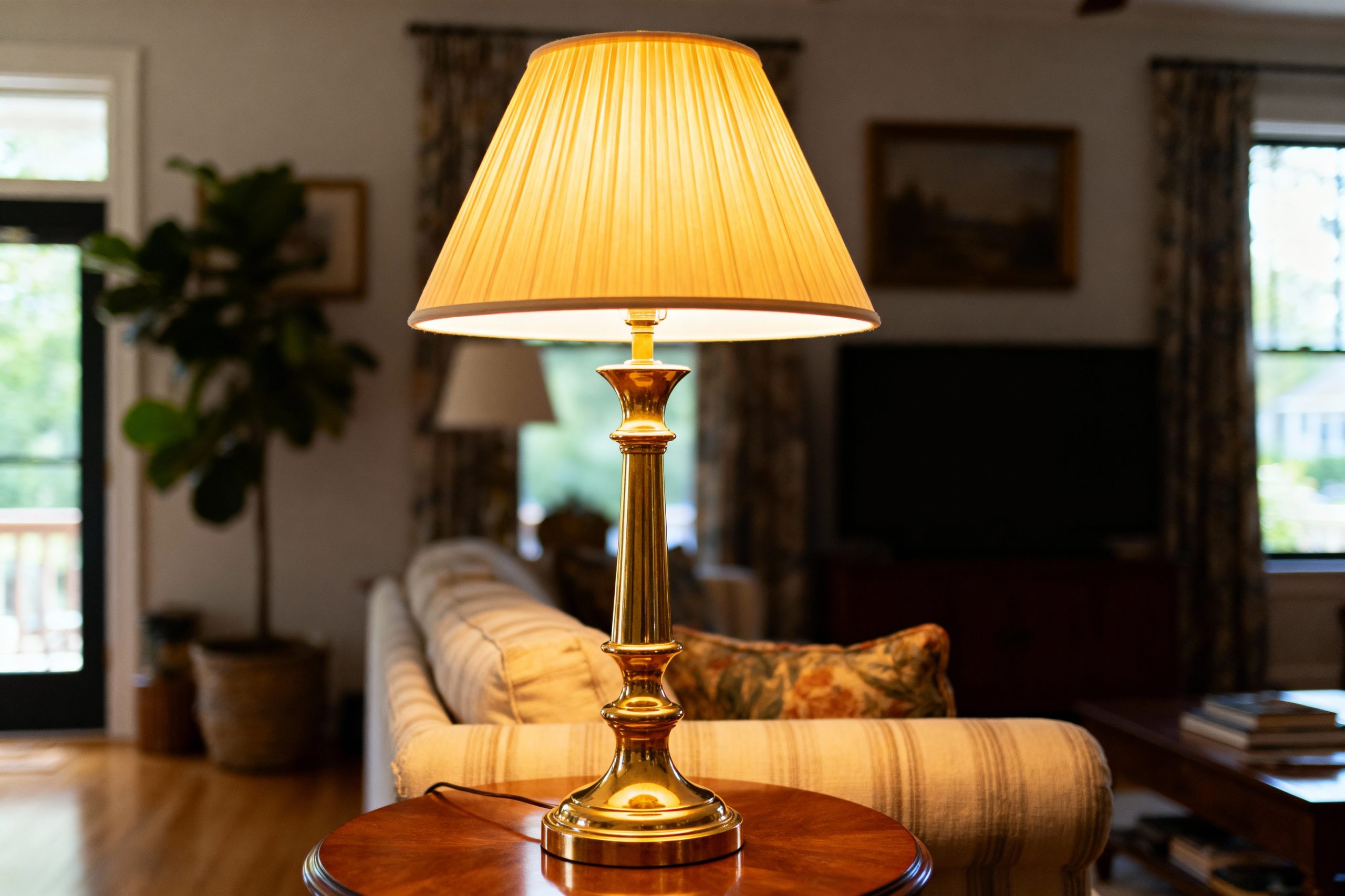
- 10%: Accent Color. Those little touches that pop—cushions, decor objects, a statement lamp, or even a unique throw.
And there you have it—a palette that’s balanced and visually satisfying. Guyton explains it’s essentially “a matter of equilibrium” and the rule does the balancing for you. As she puts it, if you stick to these percentages—even when using similar color tones—you’ll likely end up mixing several shades together in a harmonious ‘masterpiece’.
How to Use It in Any Room
This rule isn’t just for show-off living rooms, either; it can help you design every space under your roof. You’ll need to tailor the formula depending on the room:
- In the living room, the dominant 60% usually means your walls or the largest items of furniture.
- In the kitchen, your cupboards and wall units typically hog the 60% spotlight.
Always adapt the rule for the space you’re working in—and take stock of existing materials and colors. Got wood trim or paneling that stands out? Factor that into your 30% or 10% sections accordingly. Drawing a quick floor plan can help you spot what counts as dominant, secondary, and accent elements in your specific room.
Choosing Your Colors: The Wheel is Your Friend
Stuck for color choices? The color wheel isn’t just for art teachers and graphic designers. Use it to make the rule work for you:
- If you want contrast: pick a complementary color (that’s the one directly opposite your dominant color on the wheel).
- If subtler vibes are more your thing: choose colors that sit close to each other on the wheel for a harmonious look.
Whatever your preference—bold or muted, classic or modern—the 60-30-10 blueprint gives you a reliable and repeatable framework to mix colors without the panic.
So next time you find yourself staring down an empty room, brush in hand, remember: you don’t have to be a color genius to create balance. With the 60-30-10 rule, all you need is a little math, a dash of creativity, and maybe a cheerful accent pillow or two. Happy decorating!

With a discerning eye for exceptional craftsmanship and timeless beauty, Edward has dedicated his career to sourcing and curating fine antique furniture from across USA. His deep appreciation for historical design, from Georgian elegance to Art Deco sophistication, guides collectors and enthusiasts in discovering pieces that tell stories of bygone eras. Through his expertise and genuine passion, he helps preserve the artistry of master cabinetmakers while bringing distinguished character into contemporary homes.